Fonts! In the world of communication, fonts are the one visual element you CAN’T escape. No matter how simple your approach to design and marketing, if you’re sharing information, you’re choosing a font. And whether you realize it or not, you’re saying something with your font choice.
Here are some of the most important factors to consider when choosing a font, plus some of my favourite recommendations for each. (I use some fancy type terms in this article—if any of them lose you, check out my previous post on typographic terms).
First, Implementation—What are you using the font for?
The first thing you need to do is consider what you’re using the font for, and the implications and limitations that come with it.
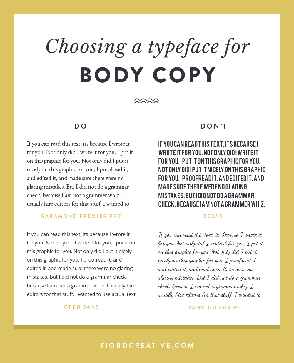
Body Copy – the main “body” of a written piece of work. Body copy (like this blog post) is usually set in large blocks, and needs to be not only legible, but easy to read. A readable font is created with proper spacing and ligatures that make subconscious reading easier. One of my professors used to say “a good body font is one that nobody notices.” This is NOT the place to be unique or flashy. A poor type choice for body copy could mean your reader just gets tired of trying to read, regardless of how good your writing is!
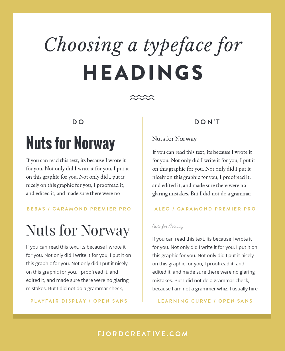
Headings – Headings are an important addition to any piece of communication. Varying your type styles helps provide wayfinding tools for your reader, and choosing the right styles will provide a strong hierarchy of information. If your heading is set in the same style as your body copy, chances are your reader might not even see it, passing over the information they’re looking for entirely. By varying the size and visual weight, a contrasting heading helps your reader know where sections begin and end. A good rule of thumb is to mix a sans-serif with a serif. Your two typefaces should be different enough to contrast. Again, a poor choice in heading could mean your reader gets tired of the effort of finding their way through your writing. Unlike body copy, this is a great place to get creative and bold! Tastefully of course…
Logos – while I am of course a big fan of hiring a professional brand designer to craft you a really special brand (and not just a logo!), it can definitely be one of the business investments you need to work up to. If you’re choosing a typeface for your own logo, you’ll be best served by spending a good amount of time making a careful choice! You’ll want to consider legibility, personality, and quality. Your font choice only has to work for the letters in your logo, so you don’t really have to worry about things like punctuation marks or ligatures. Remember that your logo needs to work at large and small sizes, should have a vertical and horizontal version, and shouldn’t look exactly like someone else’s.You can be brave, but don’t get crazy unless you’re branding Crazy. A clean, intentional look to your logo will lend you a lot of credibility. Make a careful choice!
Social Images – choosing a font for your social media sharing images is somewhere between choosing a heading and a logo font. It’s helpful if the design has a little bit of interest, but it still needs to be versatile enough for any future uses. You’ll want to make sure the type you choose will look good in uppercase and lowercase, dark and light, and be legible at small sizes while also looking good at full-size. You want to be consistent with your typefaces, creating a branded look over all of your posts for the strongest added value to your brand. If your branding already incorporates certain typefaces, stick with these!
Next, Personality—Who is this font saying I am?
Font personality communicates a lot, and I see it overlooked on landscaping trailers everywhere. Some classically misunderstood font personalities are Comic Sans and Papyrus—arguably decently designed fonts—which get used for everything from daycares centers to paintball courses to notary offices to blockbuster movies (*ahem* Avatar). A font with a big personality should be carefully considered and matched with the appropriate big message! The visual characteristics of each font are kind of like our clothing choices. They can say “business” or “casual,” “budget” or “luxury.” They can say “I’m an unpredictable artist!” or “I’ll keep your money safe.”
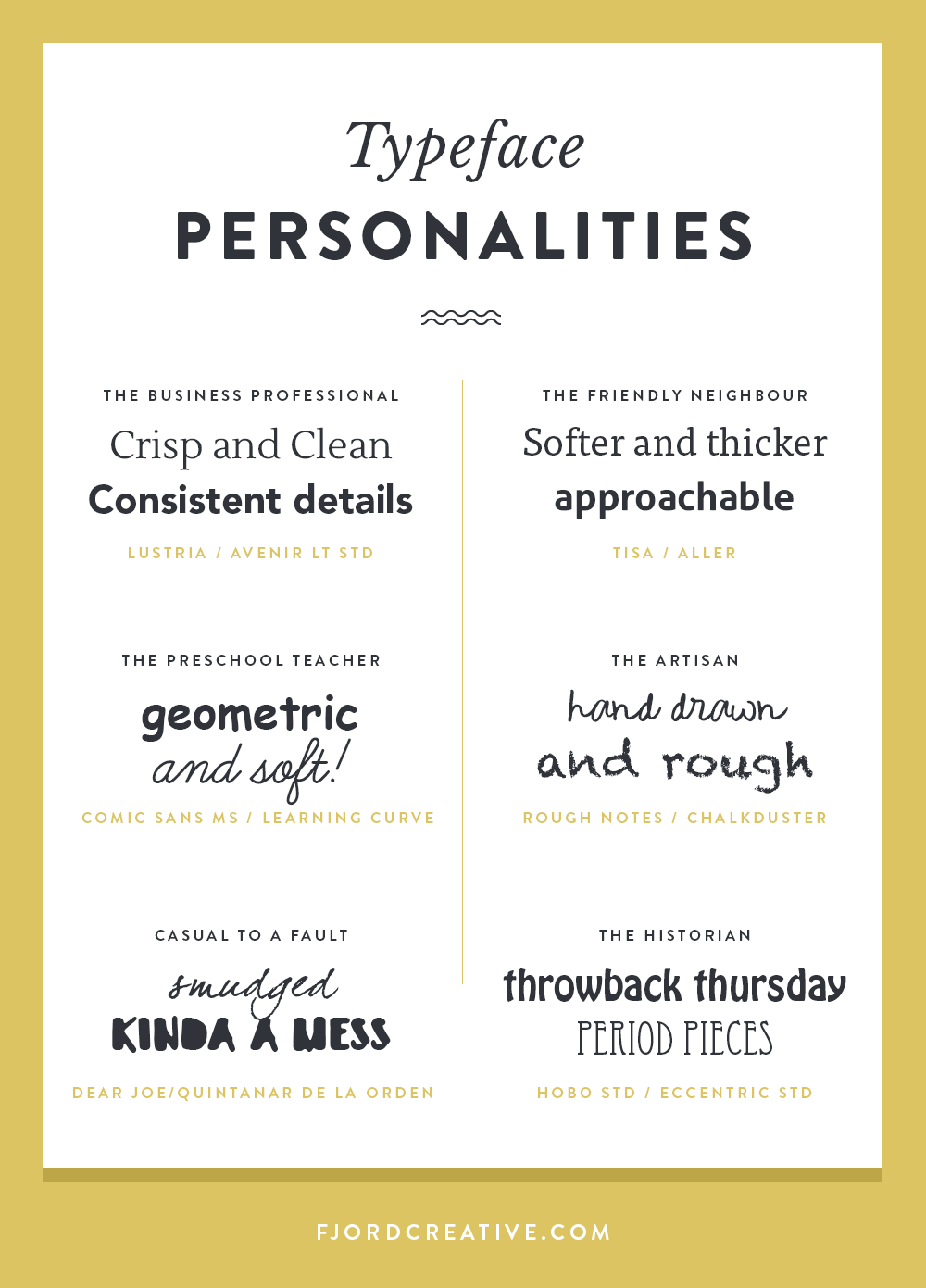
- Crisp, consistent detailing usually communicates professionalism and quality.
- Sharp edges and thin lines can communicate luxury(or stuffiness). Softened edges and thicker lines bring in more friendliness and approachability.
- Geometry combined with soft edges can say “suitable for children,” mimicking the base letterforms we learn to create.
- Rough or imperfect, hand-drawn lines can communicate a human connection or personal effect.
- Grungy or messy detailing, especially in this era of design, can communicate low budget or bad taste. Sorry! Grungy type is a look of the past, and in general is only appropriate for a few industries that take advantage of that connection to the early 2000’s or 90’s era. Some types of music, for instance, or skate / snow brands that are appealing to a certain demographic from that era.
Lastly, Quality—is this font going to hold up for its use?
Font quality can refer to the file type (OTF [opentype] are made to work anywhere, while TTF [truetype] might cause you trouble) or how well the font is designed. Professional type designers spend countless hours perfecting every single detail of each letter, how each letter works with each other letter, or how the letters interact with punctuation. They design different variations for different uses (for example, some fonts have variations like “caption” “book” “display” which infer their intended uses), tweaking the details and spacing so that they work better at larger or smaller sizes. A well-crafted font might have a huge library of “glyphs” – additional letter variations or type elements that allow for other languages and give flexibility to the font.
A poorly crafted font will have none of these things. It may work well for one word in one place, but when you write out a whole line you realize it’s not built with enough space between words. It may look great at a small size, but when you zoom in you realize the details are just mashed in and look really terrible when you use it as a heading. (beware sites like Dafont – there are some gems, but most are poorly crafted and of poor taste)
Too much detail in a font can make it become kitschy or tacky, or just illegible. The key in detailed type is CARE, which usually means crafting it by hand to make sure it really works. Detailed type-based graphics are certainly in-style, but fonts aren’t often capable of achieving this look without heavy customizing.
We can’t overlook licensing either – custom, well-crafted fonts often come with a hefty price tag. There are millions of free fonts, which range in value. If you’re on a budget, the key is identifying the typefaces that are high quality but of such standard use that they’re readily available or open-source (meaning nobody gets paid). These days there is a pretty great selection of fonts that fit into this category (google fonts). There are also a lot of novice type designers doing a pretty good job at creating nice typefaces at affordable prices through vendors like Creative Market. Take note as well, some free fonts are ONLY free if you’re using them for personal use. This means you can’t use on anything you’re getting paid for unless you buy a commercial license.